
Originally this was going to be a blog post ranting about remote controls for home entertainment systems. For the most part, they have way too many buttons! I don’t think I have a particularly high-end setup at home — but I still had to type up instructions so that the rest of the family could use it. Do the engineers at these companies not have houseguests? Or babysitters?
With persistent rumors of Apple getting into the TV business in a big way, you’d think the CE industry would move quickly to plug its obvious weakness here. Clearly, if the folks in Cupertino are going to come after you, they are going to do it on the basis of sleek industrial design and product simplicity. TV manufacturers do pretty well on the industrial design front (at least at the high end of their product lines), but the entire CE industry has a case of button-itis.

Then I started to realize that senseless complexity isn’t limited to my home entertainment system. Instead, it pervades most of my electronic and software life. To the left is a picture of the remote control for the (generally very good) InFocus projector we have in one of Cardinal Peak’s conference rooms. It’s got 30 buttons!
This is for a device that we have a lot of people trying to use, including visitors. You want to plug in your computer, turn it on, and start the meeting. At most you want power on/off and input select: That should be two buttons. (Don’t get me started about how you have to press the Off button twice to turn the unit off. Who thought this was a good idea?)
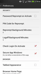
Lest you think the problem is unique to hardware engineers, below is the preferences pane for the Android version of LastPass.
I think of myself as a power user of most of my software, but I have no idea what half these checkboxes do, or why they would be options. What’s the difference between “Reprompt Background Minutes” and “Logoff Background Minutes”? Why wouldn’t I want it to always “Check Login On Activate” or have “Secure App Windows”?
Believe me, I could create a whole Hall of Shame for this stuff.
To be clear, there is a category of sensible complexity, where the product in question is targeted toward professionals who will be using it constantly; who are willing to invest time learning the details; and who insist on fine-grain control over the product’s behavior. I’d put Google Adwords, Salesforce, Adobe Photoshop, Apple’s Xcode, and Avid Pro Tools all in this category: Each is complex, but it stands to reason that it should be.
The average product, however, is designed for occasional users, and they are just trying to get something simple done. They don’t want the cognitive load of figuring out a complex interface.
For each button or option, product engineers would be well served to question whether it could be eliminated for 80% of the users. In addition to pleasing customers, this type of simplicity has added benefits, because it reduces the testing matrix. (I played a bit with some of those LastPass options, and I suspect several of them don’t work as intended.)
I don’t think simplicity needs to be the sole province of Apple. It’s achievable for most engineering teams if we just spend a little time thinking about it. Hopefully, that’s a goal that the entire tech industry can aspire to.
For what it’s worth, I think LastPass is a fine product, one which fills a critical need in a modern workflow and which I’ve recommended to numerous people. Their usability leaves quite a bit to be desired, however.